Friday, July 07, 2006

Welcome To The Readers of 'Making Movies'

Howdy! Just wanted to take a moment to welcome all the readers of Jim Thompson's great little slice of the blogosphere, Making Movies.

For everyone else who might not know, Jim runs an "officially" sanctioned blog as part of the Houston Chronicle newspaper's team of newly revamped bloggers. Jim's part of that team, and I must say, the first NASA employee (that I'm aware of) to swing on by my slice of the blogosphere, webosphere, whateverkindofsphere, leave a comment and I think I know why.

Jim has some quality concerns with YouTube and we both agree that neither of the big sites is going to win an award for high quality looking video streams.

Here's a quick peek at Jim's shootout of Google Video and YouTube Video.
If you've been reading this blog for long, you know I have a problem with the quality of YouTube's transcoded videos. YouTube uses an older version of the FLV video codec, and transcodes its videos to too low a bitrate. I discovered this when I uploaded my one-minute video to YouTube. It turns out that this particular video is a kind of torture test for video compression, because of all its scene detail and motion. So I'm going to trot it out one more time.

Now in fairness to Jim, and also because the man is a NASA software engineer, I can't argue that it appears the Google Video clip video quality looks better. How can I begin to compete with a NASA guy? I got my degree in Journalism from a school in Kentucky. Jim, well he only helps WRITE CODE for our SPACE SHUTTLE Program. He's got the freakin' ultimate trump card.
Me: Google Video Sucks.

Jim: Oh yeah? Well, I just helped launch the Space Shuttle.

Me: Hmm, would ya look at the time? I gotta go paint the kitchen.
But in all seriousness, anytime like minds get together cool things happen and I'm glad Jim is passionate enough about this endeavor that out of what must be a busy workload he takes the time to talk about his love for making movies in such an open forum both on his site and over here.

So to Jim and all you fine Texas folks, welcome to Reno Digital. Make yourselves at home. Stay a while. We've got lots of cool stuff coming, and if you're interested in movie making and video editing then you've come to the right place whether its over on Making Movies or right here. Plus, take a look at the sidebar links and see if there aren't a few sites you might not have visited. We'll probably bump into each other elsewhere. If we do, don't be afraid to say hi.

Ain't the internet cool?

Thursday, July 06, 2006

The Google Video and YouTube Video Shootout

As more and more of the free video hosting services spring up I thought I'd take a moment to compare the relative quality of the two largest providers of the service for ease of use, available options and image quality. First up, Google Video. Signing up for both services requires the same information and both signups work as intended.

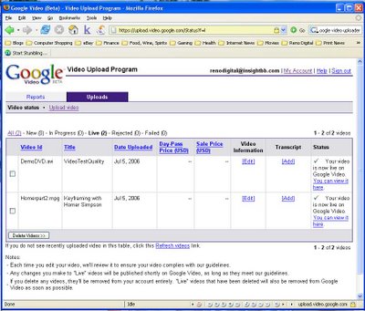
The process for uploading video to Google is essentially the same as uploading video to YouTube with one significant difference. The Google Video Uploader application allows you to cue multiple videos and runs as a simple standalone application so you don't have to be logged in via your browser to manage your videos or upload them. You'll simply enter your Google account information and password and the application does the rest.

Google Video Uploader Interface


UPLOAD INTERFACE: Google: 1 YouTube: 0

As far as speed, neither seems especially fast although in unscientific testing I believe that YouTube is marginally faster by about 10%. But there are far too many variables to make any definitive statement regarding who's service is the fastest.

UPLOAD SPEEDS: Google: 1 YouTube: 1

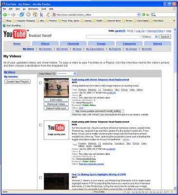
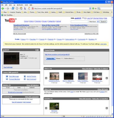
Once you get the video uploaded, accessing it on the Google site is more complicated than necessary as it seems they've nested most everything behind something else. For instance, here are the user control panels from each site.

GOOGLE USER CONTROL PANEL

YOUTUBE USER CONTROL PANEL

Now, the user control panel is the screen where you should be able to easily manage your existing videos and make any adjustments. Google, for some reason, doesn't want to let you do it the easy way. If you look, Google's interface for this page gives you essentially three obvious options. You can delete the video, you can edit the video information or you can actually go to the viewing page. That's it in a nutshell. Oh and you can go to your account from here as well. Which seems strange since I thought you were already IN your account.

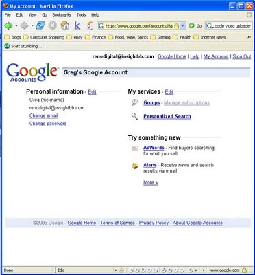
See Google, in it's infinite wisdom, lets you use the same logon for everything they own which would be nice except in this case if you click the my account link it takes you to this:

Notice anything missing? What happened to Google Video? You were just dumped back to some midpoint for all of the Google Services. I think. But based on the design of that page I can't be sure. I can be sure that based on that page your only way back to Google Video is the browser's back button. That's right, we've got all the coders money can buy but we forgot to code a nice link on this page to take you back. We do have the options for logging out or getting help but I'm not convinced that the help desk folks aren't the same ones who coded this in the first place so I'll take my chances with the back button.

Now look back up the page at the YouTube version of that screen. What you see there is your video clip (with a still image to jog your memory), a watchable link, the URL for sending it to people in emails or for posting on non-embeddable webpages, the status of the video, the number of views, the rating, any comments, the ability to edit the video, the ability to remove the video, and the ability to make that your profile icon. Oh, and tags for the video.

USER CONTROL PANEL: Google: 0 YouTube: 1

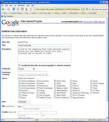
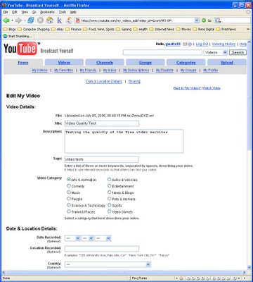
Clicking the Edit Video button on each takes you to a page that looks like this:


GOOGLE EDIT VIDEO PANEL


YOUTUBE EDIT VIDEO PANEL


I'll give the gang at Google this much, they sure do know how to put together a category list. It trounces the YouTube category choices by more than 2 to 1 which would be great if you could actually do something worthwhile on this page other than that. Over on the YouTube version of this page, you can copy the fully embeddable (is embeddable a word?) code for your video on this page, you can watch the video, you can go back to your My Videos Page or you can...wait a minute.

I'm seeing a trend here. Every page of YouTube has a consistency in that those handy tabs on the top are always available to take you to every area you need or want. Google? You could always click the My Account page for a laugh and then hit the back button. But why torment yourself that way?

EDIT VIDEO PANEL: Google: 0 YouTube: 1

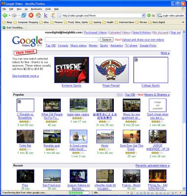
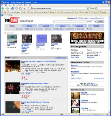
Next up, let's take a gander at the actual Home Page for each site.


I don't know about you but I don't read Hiragana or Katakana but I sure know it when I see it and I see one of the first videos on this page is clearly in a language other than my own so Google needs to work on filtering their content so it makes sense to the end user. Hey, isn't that German and Vietnamese on there as well? Cool. Now maybe someone will start posting Language Learning videos so I can figure out what I'm missing.

Don't get me wrong, they're each a beautiful looking language but it does me no good since I have no earthly idea what that video might be and I'm not just randomly clicking on a video link because weird things happen when you do.

HOME PAGE DESIGN: Google: 0 YouTube: 1

I feel like I'm missing something.

Oh yeah. We still haven't seen the embeddable (there's that word again) code on the Google site so that we can add a watchable video to our page. And I know for sure it's here somewhere because during my random wandering around I saw it. I think. Well, the obvious place to look is on the video page. So back to the excel spreadsheet of video pages we go. Could a site for cool content and distribution really be this bland?

Apparently so. Alrighty let's click on the view video link.


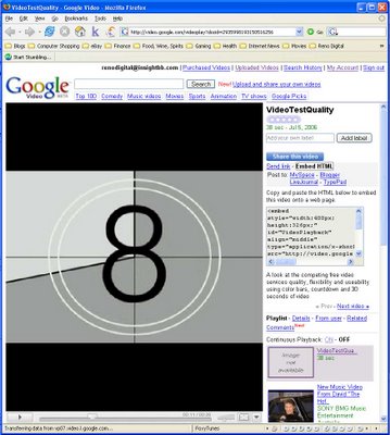
AHA! There's the embeddable code for your video. Except it's not really there when you arrive at the page. Oh no. You have to click the share video button.

But wait. There's more. Then you have to click the embedded html button to finally see that bit of code which YouTube has been dangling in front of you since you got to their version of this page. But you probably don't need it if you're using YouTube since they were kind enough to provide it for you 4 pages ago and they didn't make you click 12 times to find it.

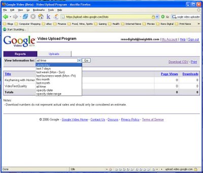
The last page we're going to look at is the Video Reports Page. Actually, that's a lie. What I'm going to do is stop making fun of the excel spreadsheet look and feel of Google and just point out that, oh hell, nevermind; see for yourself.


VIDEO REPORTS PANEL: Google: 0 YouTube: 1

Finally, we come to the whole point of both sites. Namely, hosting free videos for all the world to watch. Without further adieu, I give you the video comparison.


Both feeds are based on the same video clip. The uploaded file was near the maximum allowable size at 90 megabytes. I also purposely didn't down rez it because I don't think it matters because it looks like they down rez it for you so the DV-AVI resolution of 720x480 was what they got to work with.

As you can see, the Google feed is smaller at 400x326 to the YouTube feed which is 425x350. Google's does look better but I'm not sure that's not a product of making the video smaller than anything else since I'm just not inclined to give them the benefit of having developed a radically better compression codebase. So on video quality, it's a tie.


VIDEO QUALITY: Google: 1 YouTube: 1

Now we come to the part where I tabulate the score and arrive at the grand (and painfully obvious) conclusion.

Drum roll please. May I have the envelope?

THE WINNER WITH 6 POINTS: YouTube

Google, take your 2 points and come back when you're ready. I was going to include the latest edition to the free video sites and one that's getting alot of press because they claim they're going to pay you for showing your video Eefoof (yes, that's their real site name) but after trying to get access and then seeing the quality of the video feed when I finally did I decided that they might need some quality time before gazing over there with a critical eye. I'll just leave it at that.

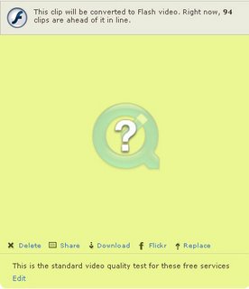
UPDATED for Jim: Vimeo has a nice site design and is easily the fastest of the services I've tested for upload speeds but there are three issues that would keep me from using the service. The first is I can't actually get my video to play. Here's the screen:

Aside from getting that question mark for a video which I've uploaded to every other site without fail, I also noticed that the upload process doesn't actually transcode the video. Apparently they set it up so that step of the process doesn't occur until someone actually wants to play the video. You can see the que near the top of that shot. Having a que like that creates a negative user experience because it makes the first person to want to see the video wait.

Finally, Vimeo has a limit of 30 megabytes. Per week. So they've solved the issue of bandwidth costs by throttling users to a really meager amount of available upload size and there doesn't appear to be any way to increase that limit.

Overall, the barrier to entry seems ridiculous for Vimeo when taking into account the competing services. Not a good experience and I wouldn't recommend it to others unless you have very little content you want to share.

CORRECTION: After going back into Vimeo and starting a new video download I watched the process unfold and while the question mark still pops up and it appears to be done, it in fact is simply taking a really, really long time so that eventually the video is available.

Wednesday, July 05, 2006

PRODUCTION EQUIPMENT: A Review of the Cool Steadicam Merlin

For those video production folks looking to take your personal video skills to a whole new level you owe it to yourself to consider a tool like the Merlin. There's a nice review of the Merlin over on DV.com.

From the BOTTOM LINE
The Merlin is the best kind of magic-technology that works so well that it seems magical. This unique stabilizer follows my golden rule: appropriate solutions always take common sense into account. The Merlin is the right size, weight, and price. It's an excellent solution for stabilizing small camcorders.

Head over here to read the full review.

Check out the official site for more information along with a short video demo.

HDV CAMERAS: The Sony HVR-A1 HDV Review

Since HDV is the current buzzword, everyone and their brother seems to be talking about the move from miniDV to HDV. Here's a review of Sony's midlevel Prosumer camcorder, the HVR-A1. It sits between the cheaper HC3 and the Z1, and seems to offer a nice feature mix as you'll see.
Let me be clear at this point. The image quality of the A1 (or the bigger and more expensive Z1, which has three CCDs) will never compare side by side with the full-sized HDCAM cameras, but more and more these small, cheap HDV cameras are providing acceptable B-roll and alternative angle shots to the productions that I work on. If anything, the A1 should be compared with the Z1, and in that realm it is awfully close. Except under low-light situations where the A1 shows quite a bit more noise in the shadows, this one-chip wonder is almost identical in image quality to the Z1, which has a terrific picture to begin with. In a pinch, I would have no problem cutting shots from the A1 into a show shot with a Varicam or HDCAM. Especially if using a small camera is the only option.

The rest of the review can be found here.

Tip Of The Week

    Use ALT-[ and ALT-] with the CTI for controlling the location of the WORKBAR.
    Have a great tip or trick? Share it with everyone by sending your tips to Tip Of The Week

Editing Essentials

    The Timeline’s current-time indicator(CTI), a blue triangle in the time ruler, corresponds with the frame displayed in the Monitor panel’s Timeline view. A vertical line extends from this current-time indicator through all the tracks.

inside Elements 2.0

Tutorials

EXAMPLE VIDEOS

Hall of fame

    Will your REP video be the first entry in our Hall of Fame?

Poll

    What kind of Premiere 2.0 How-To video would you most like to see?
    Using Photoshop Elements with Premiere Elements
    Organizing Project Workflows
    Creating Cool Stuff with the Traveling Matte Effect
    Using Sound Effectively
    Using Titles Effectively
    Just the Basics Please - Editing for the Beginner
    Other - Please Leave A Comment for your Suggestion
      
    Free polls from Pollhost.com

Archives

About me

  • I'm Greg Watts
  • From
My profile